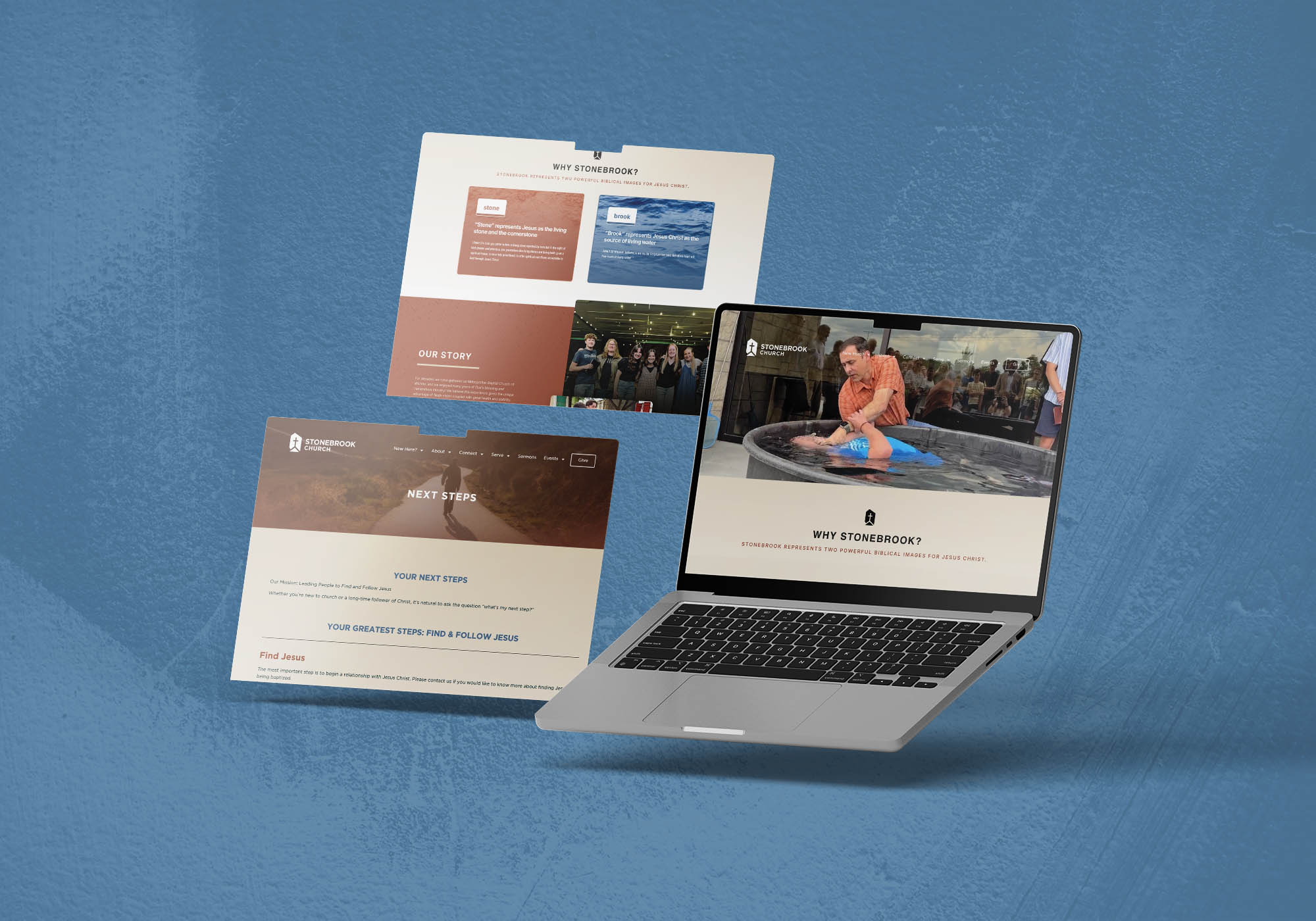
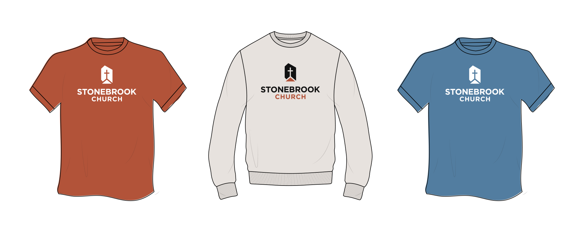
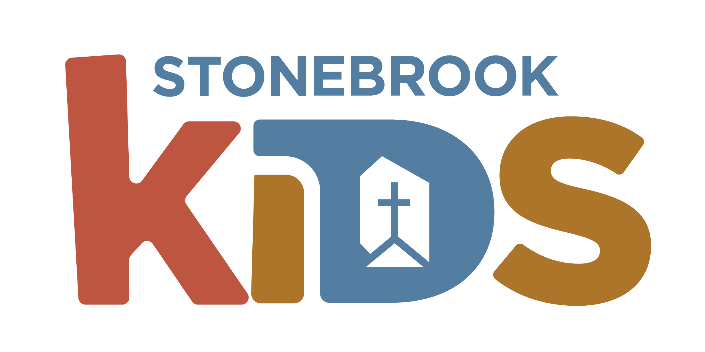
For decades Metropolitan Baptist Church of Wichita enjoyed many years of ministry in their community. As the church followed God’s leading to relocate and relaunch as Stonebrook Church in Northwest Wichita, they were looking to rebrand as they moved into their new facility. We partnered with the Stonebrook to establish new logo, brand guidelines and a color system.
Logo Overview
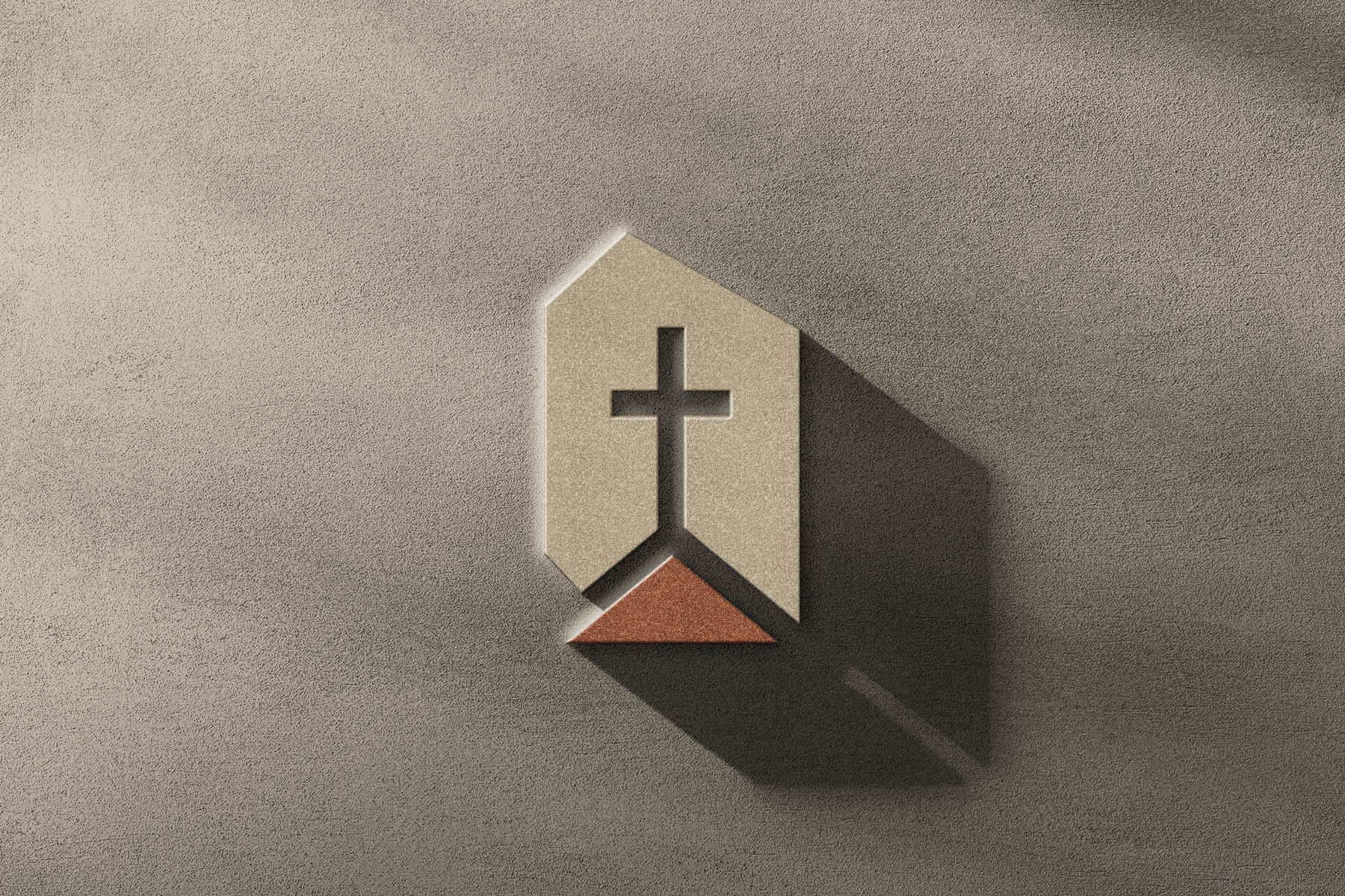
The overall shape is reflective of a stone. Irregular. Dimensional. The shape is irregular but the shape of the cross isn’t. The triangle represents our lives centered on the cross—anchored to truth. The varying shapes coming together points to 1 Peter 2:5: “you yourselves like living stones are being built up as a spiritual house.”